




Case study SPRING FINANCIAL
The Spring customer portal
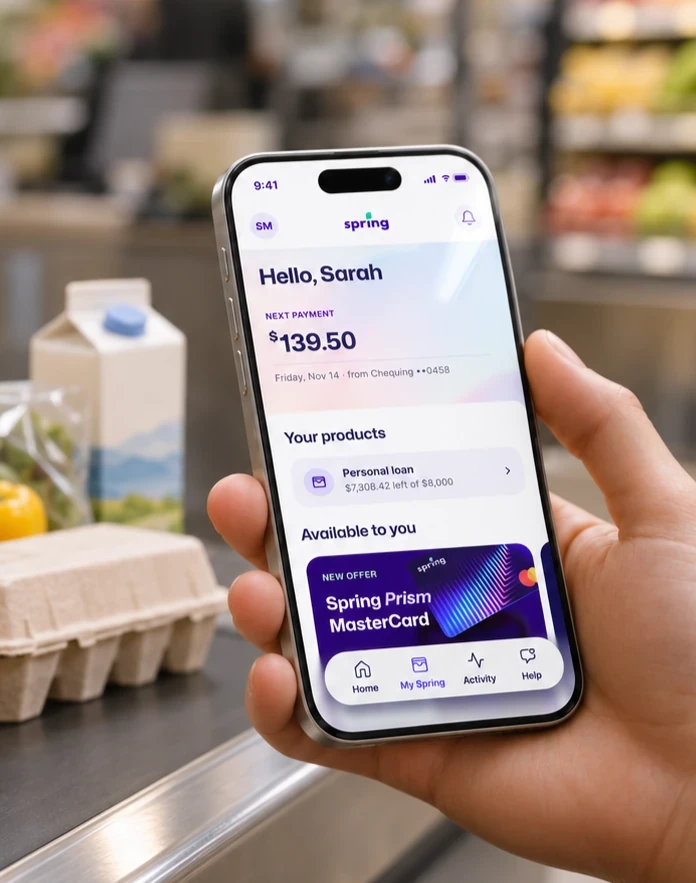
Designed by humans, built by machines
Spring Financial lends to Canadians who can’t get credit from a bank. The business runs on three products: a personal loan, The Foundation (a twelve month credit builder that reports payments to TransUnion and Equifax while holding the customer’s money in trust), and Evergreen, the loan a Foundation customer can move into once they’ve built some history.
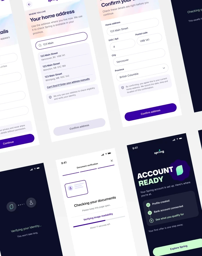
The portal is the account experience for all three. It’s where someone sees their balance, their next payment date, their documents and how far through the program they are, and where they do the things that previously meant calling in.
Why did we build it?
Spring had no self serve layer. Once a customer was approved, every question went to an agent, down to what day the money comes out.
We performed a thorough analysis to size the problem properly, and the numbers were worse than what we had anticipated.
-
795,969 of 1.84 million applicants had applied more than once. That’s 43% of everyone who ever applied. Spring was paying to reacquire people who already knew the brand, because there was no door for them to come back through.
-
13.8% of signed agreements reversed within an hour of signing, and that rate had climbed from 10% to 16.1% over the period we looked at. People were signing and then losing their nerve almost immediately, with nothing to check and no way to reassure themselves except phoning the company that had just lent to them.
-
About 1.2% of Foundation customers ever reached Evergreen. The figure being quoted internally was closer to 10%. The ladder Spring describes to its customers was barely connected at the top.
These three issues pointed to one glaring problem:
There was nowhere for a relationship to live between the application and the agent.
Research
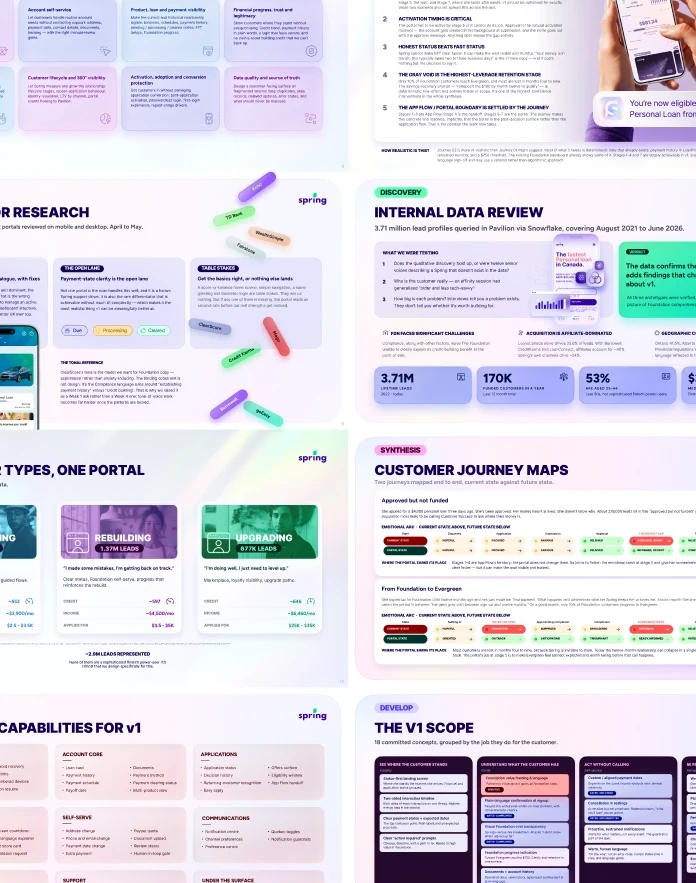
We worked in three passes: internal data first, then stakeholder interviews, then customer voice, so that by the time we were asking people questions we already knew what the numbers said.
Spring’s warehouse was the backbone. It held everything we needed, just never assembled in one place: the 43% repeat application rate, the 13.8% of agreements reversing inside an hour, the real Foundation to Evergreen conversion of 1.2%, and what each credit segment actually asks to borrow. We re-ran the full set in late October, which mattered, because several figures had drifted from the earlier research deck.
Stakeholder interviews gave us the gap. Asked how many Foundation customers go on to take a loan, the business said about 10%. The warehouse said 1.2%. The number had never been checked and had hardened into something everyone repeated. That reframed V1 around the Foundation to loan path rather than treating it as one feature among several.
Public reviews and a customer survey covered the part data can’t reach. Reviews clustered around the absence of an account: not knowing where their money was, calling to ask things they felt they should be able to look up. The survey tested whether that held beyond the people annoyed enough to post.
Synthesis was affinity mapping, a journey map and a V1 capability map, which produced a revised problem statement and the prioritisation that set the release scope.
Design
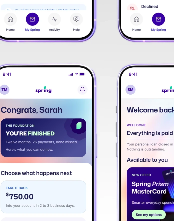
The portal was the first full product built through the Spring Design Engine. I built the system to be promptable, so colour, type and components can be addressed by name and applied at scale rather than copied by hand.
Underneath it sit eight OKLCH derived ramps stepped by lightness, with semantic aliases and component tokens pointing at them.
Every surface in the portal references an alias instead of a hex value, so the build stays consistent by construction.
Screens were scripted into Figma rather than drawn. The real gain was auditing: because the file is addressable, we could run checks across all of it. One pass corrected letter spacing on 457 text nodes at once, another swept stray blues onto the approved ramp, and a WCAG AA contrast sweep caught and fixed failures in a single pass.
None of that is realistic on a file this size by eye.

Development
Scheduled for Q1 2027

Metrics
Coming soon